Web Design (HTML/CSS/FLASH/OTHER)
Web Design Tutorials
NetTuts
Web Designers Magazine Tutorials
FireTuts (fireworks tutorials)
Web Design Library
Flash Perfection
Flash Kit
Nifty Corners
Verlee's Blog
Web Developers Handbook
YUI Grids & CSS
Max CSS Design
Understanding CSS Positioning
Go to and Learn
CSS Super Scrub
CSS3 Tutorials
A List Apart
CSS Positioning is Everything!
Slide Show Pro (Flash)
HTML For Beginners
CSS For beginners
W3 Schools
Streamline Your Process: RSS Feeds, Bookmarks, Frameworks, Design Resources
960 Grid System
CSS Tricks - Backgrounds
Creating Navigations - Rounded Corners - Rounded Corners using CSS & JQuery - 37 Navigation Techniques
Tables? No, Absolute Columns
53 CSS Techniques you can't live without
Tuesday, May 12, 2009
4 beautiful commercial website
4 beautiful commercial website

Oddzballz
nice illustrator

Stonecoast Properties
this website give me traditional and classic feel and i like the navigation.

Lanikai Properties
this give me a vacation mood. It have nice color mood and it's natural.

OYPRO
modern look~ and it's clean..... ^.^ like this so much

Oddzballz
nice illustrator

Stonecoast Properties
this website give me traditional and classic feel and i like the navigation.

Lanikai Properties
this give me a vacation mood. It have nice color mood and it's natural.

OYPRO
modern look~ and it's clean..... ^.^ like this so much
4 url + screenshoot of client and competitor's site
4 screen shoot of client's website

dutch lady website home page

dutch lady website procut page

dutch lady website about page

dutch lady website nutrition page
4 url and screen shoot of competitor's website
Nestle


Malaysia Milk Sdn Bhd


Mead Johnson


Dumex
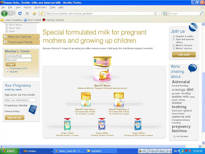

I think MMsb separate in 2part. top part have nice flash navigation, bottom part too static and i saw some of the pages top part and bottom part it cant join together. Dumex have alot information from mom pregent til baby group up but i think they can change the navigation to more shape, in this page, all shape are same " square". Nestle website are bored for me, althought the navigation got many color, it not really userfriendly for me, and the picture if Nestle no attracting too. For me, MeadJohnson is colorful but all the color feel like screaming for attention, the flash games in the website quite fun, i think they need to change the design to attract the kid or mom to play, by the way, they can change the color too.
Subscribe to:
Comments (Atom)
Tuesday, May 12, 2009
Web Design (HTML/CSS/FLASH/OTHER)
Web Design (HTML/CSS/FLASH/OTHER)
Web Design Tutorials
NetTuts
Web Designers Magazine Tutorials
FireTuts (fireworks tutorials)
Web Design Library
Flash Perfection
Flash Kit
Nifty Corners
Verlee's Blog
Web Developers Handbook
YUI Grids & CSS
Max CSS Design
Understanding CSS Positioning
Go to and Learn
CSS Super Scrub
CSS3 Tutorials
A List Apart
CSS Positioning is Everything!
Slide Show Pro (Flash)
HTML For Beginners
CSS For beginners
W3 Schools
Streamline Your Process: RSS Feeds, Bookmarks, Frameworks, Design Resources
960 Grid System
CSS Tricks - Backgrounds
Creating Navigations - Rounded Corners - Rounded Corners using CSS & JQuery - 37 Navigation Techniques
Tables? No, Absolute Columns
53 CSS Techniques you can't live without
4 beautiful commercial website
4 beautiful commercial website
Oddzballz
nice illustrator
Stonecoast Properties
this website give me traditional and classic feel and i like the navigation.
Lanikai Properties
this give me a vacation mood. It have nice color mood and it's natural.
OYPRO
modern look~ and it's clean..... ^.^ like this so much
Oddzballz
nice illustrator
Stonecoast Properties
this website give me traditional and classic feel and i like the navigation.
Lanikai Properties
this give me a vacation mood. It have nice color mood and it's natural.
OYPRO
modern look~ and it's clean..... ^.^ like this so much
4 url + screenshoot of client and competitor's site
4 screen shoot of client's website
dutch lady website home page
dutch lady website procut page
dutch lady website about page
dutch lady website nutrition page
4 url and screen shoot of competitor's website
Nestle
Malaysia Milk Sdn Bhd
Mead Johnson
Dumex
I think MMsb separate in 2part. top part have nice flash navigation, bottom part too static and i saw some of the pages top part and bottom part it cant join together. Dumex have alot information from mom pregent til baby group up but i think they can change the navigation to more shape, in this page, all shape are same " square". Nestle website are bored for me, althought the navigation got many color, it not really userfriendly for me, and the picture if Nestle no attracting too. For me, MeadJohnson is colorful but all the color feel like screaming for attention, the flash games in the website quite fun, i think they need to change the design to attract the kid or mom to play, by the way, they can change the color too.
Subscribe to:
Comments (Atom)